Clean Elections for UtahPage last updated: Saturday, 12-Feb-2022 20:43:40 EST
HOME Utah Election
Resources2020 Election
Statistical AnomaliesSecure Vote Utah
Ballot InitiativeJen's and Sophie's Big GRAMA Adventures 2022 Caucus March 8 Set Point Control
(Illustration of work by Draza Smith and Jeff O'Donnell)Utah Analysis by Jeff O'Donnell, 09 Feb 2022 (MAGARaccoon)
Simple Election Example
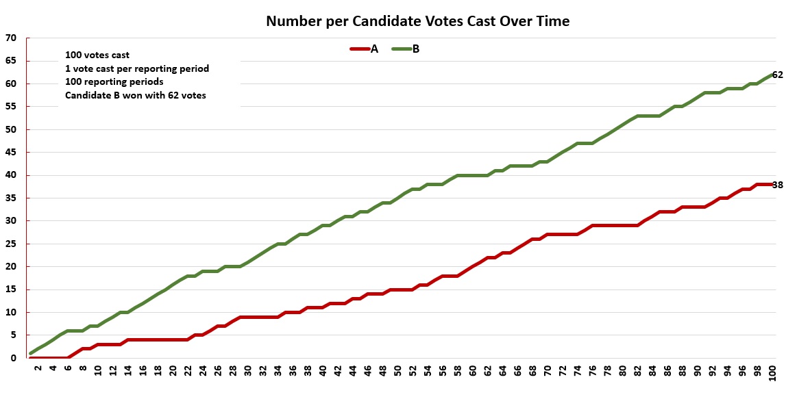
This part is being presented by the website author. Imagine a hypothetical election between Candidate A and Candidate B. To keep arithmetic simple, exactly 100 votes are cast. Candidate B wins by 62 votes. The ballots are fed into a simple but accurate tabulator machine (1 vote in = same vote out), one at a time. Each time a ballot is fed in, the machine tallies the result and reports the current state of the election. There are 100 reporting intervals.
The results resemble this graph. The two graph lines show similar characteristics, but they do not possess the same shape, i.e., one shape cannot be fit onto the other so they are well aligned. In an interval in which a ballot is cast for Candidate A, A's graph line will rise, and Candidate B's graph line will flatten, and vice versa. Each line steadily crawls up towards the final tally for that candidate.
For the simulation that produced these graphs, the ballots were shuffled. Depending on the order the votes are fed into the machine, the lines might change a bit, but they will always crawl upwards, one line will flatten in the same interval that the other rises, and they will hit endpoints of 62 and 38. Reporting "period" and reporting "interval" are used interchangably, and are called "data releases" or "data interval" by Steven Christiansen in his video.
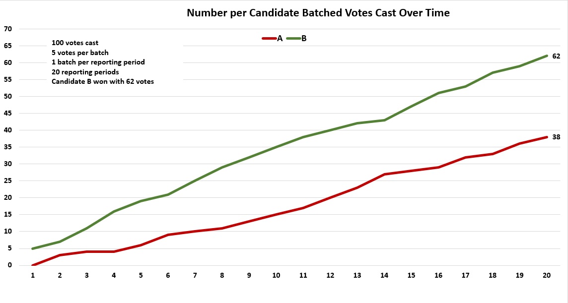
Now, suppose that same election with 100 votes cast was counted with an accurate tabulator machine that can read up to 5 votes at a time and report them as a single batch. Each time a batch of 5 ballots is fed in, that batch is reported. So 20 batches are reported.
The results are in the next graph. The two graph lines show similar characteristics, but they do not possess the same shape.
Unlike the prior chart, in which a single vote in a reporting interval either went to one candidate or the other, and thus one line would rise and one line would flatten, a batch of 5 votes could be split across the candidates. So it's possible to see the graph lines both rise in the same reporting interval or both fall in the same interval. However, for the graph lines to be matched and synchronized in their rise and fall across all reporting intervals warrants close scrutiny.
As NO time during the timeline of the election shown above are votes SUBTRACTED from a candidate. Once a candidate gains a vote, that vote is retained.
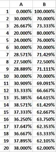
Now let's look at the numbers for the same batched data as percentages. The sum of the percentage of votes returned for A and the percentage for B at a given reporting interval should always be 100%. So in the very first reporting interval, Candidate A did not have any votes (0%) and Candidate B got all 5 votes (100%). As of interval #10, Candidate A has 30% of the cumulative votes, and Candidate B has 70% of the votes tallied at that point. By the final interval, Candidate A has received 38% of the votes and Candidate B has received 62%. For each reporting interval, the sum of the percentages adds up to 100% cast up through that interval.At NO time do we see a negative percentage balanced by an excessively positive percentage exceeding 100%.
As you look down the columns, you'll see the percentages bounce around a little. This is reflected in the graph below. The two lines do not flatten out or hover around specific values over several reporting intervals. The lines keep readjusting. Only from interval #19 to interval #20 do the lines finally flatten out towards their final values.
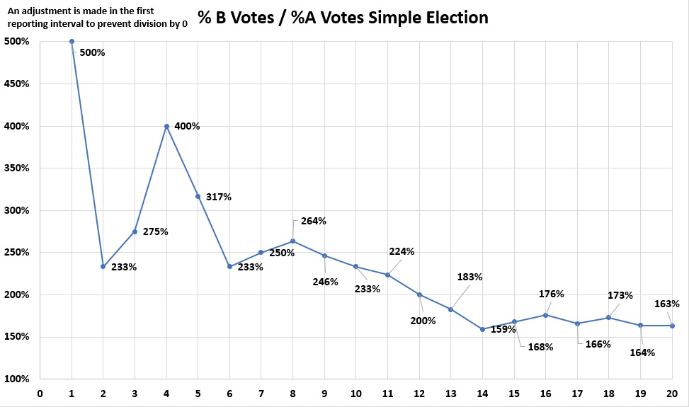
Finally, we'll look at a cumulative percentage ratio of Candidate B over Candidate A over time, using batched reporting. Notice that this is a risky operation. Since A got no votes during the first reporting interval, then division would be over 0, which is infinite. So for illustration purposes, a percentage was put in to prevent the graph from blowing up.
A real time reporting system graphing the results would have to catch that in real time and make an adjustment accordingly. Once both candidates received votes, such an adjustment would no longer be necessary.
Otherwise, the ratio bounces around over time until the final ratio is reached.
Simple Three Way Race Election Example
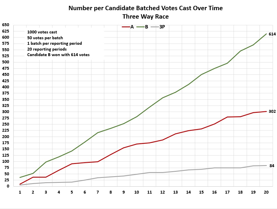
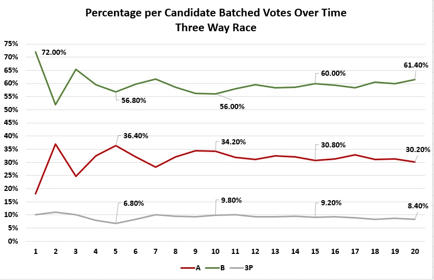
This part is also being presented by the website author. Now let's look at something slightly more realistic, a race with two major candidates and a minor third party candidate (or perhaps a summation of third party votes). To keep math simple, it is an election with 1000 votes cast.
Now notice below that the percentage of cumulative votes over time for Candidates A and B graph lines do not exactly mirror each other as in the simple example above. That's because the third party has taken votes away from both of them. However, the tallies do eventually drift toward their final percentages, without hovering around any particular values.
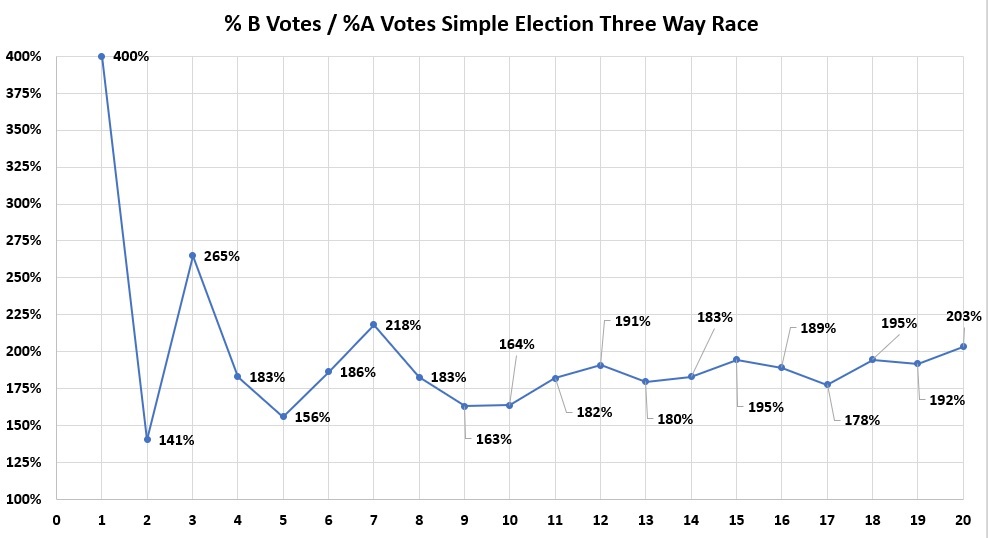
And then finally we look at the cumulative percentage ratio of B over A in the Three Way Race. No 0 division adjustment was needed in this case. Again, the ratio bounces around a little until the final ratio is reached.
Everything up to this point shows sort of what we'd expect in a clean, accurate election.
Edison Data Analysis
Draza Smith, an electrical and computer engineer, used the data from the New York Times election results website to analyze the 2020 results. The source of the data feed is from Edison Research so the data is often called the Edison data. All the states submit their results electronically to this website via an Edison feed. She and Jeffrey O'Donnell (AKA The Lone Raccoon) have worked extensively with the Edison data. Everything based on Edison, shown below, is strictly UTAH data.
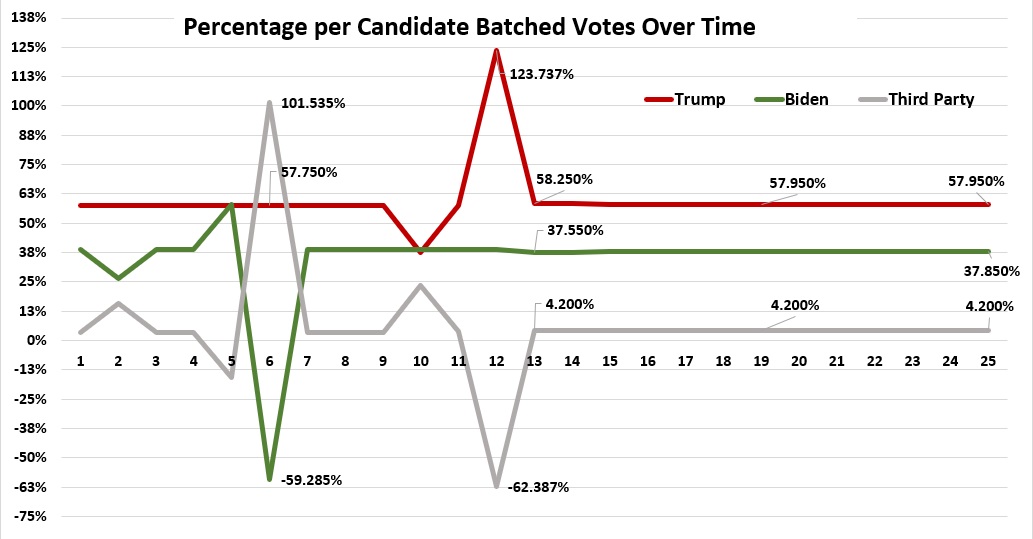
About 56 minutes into his video, former Utah State GOP Rep. Steven Christiansen presents Draza Smith's graph of the Trump and Biden Edison returns over some 94 reporting intervals. The intervals are timestamped so this ensures that they can be correctly sequenced.
The graph was originally labeled Utah %Trump votes/%Biden votes but I think the intention was to plot the number of Trump votes and Biden votes and show how the graph lines resemble each other. So this is relabeled Number per Candidate Batched Votes over 94 reporting intervals.
The Trump and Biden lines are amazingly similar.
Compare the actual Trump / Biden graph on the left, to the Simple Race graph on the right.

 The graph below shows data over the first 25 reporting intervals the percentage of Trump's votes, Biden's votes, and third party votes compared to the overall votes (always 100%) for each reporting interval.
It is based on the actual Edison numbers on the left.
Look at how flat the graphs are, interrupted by some crazy dives below 0% and spikes above 100%. This raises some interesting questions.
How can the percentages remain so consistent relative to each other over such long stretches? Especially so early in the reporting?
How can votes be subtracted from a candidate?
At a given reporting interval, how can a vote count dip into negative territory? Or exceed 100%? Once a candidate gets votes, doesn't that candidate keep them?
In the 2020 election were some Utah election machines overheating / melting down, spewing out garbage data into the Edison data feed?
For comparison, look at the crazy Edison graph again compared to the percentages from the sample Three Way Race.
The Three Way Race does not show spikes above 100% or dives below 0%.
The Three Way Race graph lines do not "flat line" over several consecutive reporting intervals.
Proposed Explanation
Draza Smith has proposed that the behavior seen in the Edison graphs are what one might see in the output of a programmed version of a Proportional Integral Derivative (PID) Controller, which is a device that monitors the rate at which a process reaches a specific target value, called a Set Point. The flat lines in the Edison graph above would make sense if there were an enveloping system with predetermined Set Points to dictate the outcome.
Follow Draza on her Telegram Channel Lady Draza.
Jeff O'Donnell has 40+ years extensive experience as a software engineer. Take a look at his work at Maga Raccoon. He can also be found on Telegram as A Lone Raccoon.