Clean Elections for UtahPage last updated: Tuesday, 19-Mar-2024 20:35:32 EDT
Page initially created: 23 Jan 2022 1:29:07 EST
HOME Utah Election
Resources2020 Election
Statistical AnomaliesSecure Vote Utah
Ballot InitiativeJen's and Sophie's Big GRAMA Adventures 2022 Caucus March 8 Scroll past the Orem talk videos for the original page content "Dr. Douglas Frank's Utah Analysis on the adjusted 2020 election." This is Dr. Frank's election work in summary, as explained in the Mike Lindell movies.
Dr. Douglas Frank.
Talk in Orem, Utah.
March 12, 2024.From the mini-player you can view a video full screen. Or, click on the link above a video (part X of 16) to watch it in standard view size on Rumble. It is better to watch on Rumble so you can read the description of each part.
Dr. Douglas Frank's Utah Analysis on
the adjusted 2020 electionConcepts
population
registered voters
ballots cast
correlation coefficientratio of registered voters to population
ratio of ballots cast to registered voters
registration key
Dr. Frank explains his algorithmic election data analysis methodology at the August 2021 Cybersymposium. His focus has been on Step 1 of the election theft process.
Here is another of his presentations (Mike Lindell's "Scientific Proof" movie.)
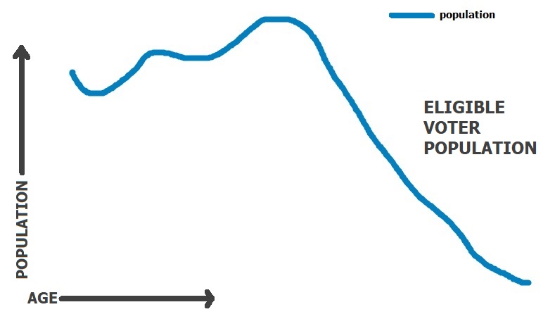
The US Census Bureau estimates population for non-census years by shifting data from a census year forward, making vital statistics adjustments. Starting from 2010 census data, estimates are thus made for 2011, 2012, 2013, etc all the way to 2020. From population data, population by age can be categorized and plotted, from age 0 to 100 (or beyond).
To get eligible voter populations, people below age 18 would be subtracted out, as well as people ineligible to vote who are age 18 and higher. (The latter demographic is a relatively minor amount compared to the population at large.) From this, a graph can be produced from age 18 to 100 of the number of eligible voters, 83 values. Dr. Frank connects those 83 values into a line graph. An eligible voter population graph resembles the picture below.
Now what about the people from that eligible population who are actually registered to vote?
Every county has a voter registration database. Your voter record contains information such as your name, address, birthdate, state ID / driver's license number, the date you were registered, and your voter history. For each election, a column is created in the database. Your record is marked in that column if you vote in that election.
If someone has not voted for a long time, they might get removed from the database. Then again, they might not. Those inactive voter records are one way that theft perpetrators can mine for voters and attach them to ballots those voters never intended to cast.
If you've been an inactive voter, and a canvasser comes to your door with voter registration data and tells you that you voted in the most recent election, you just found out that your vote was "borrowed." Active in-person voters might find this out when they show up at their polling place on Election Day and are told they've already voted. The votes of dead voters still in the database can similarly be utilized.
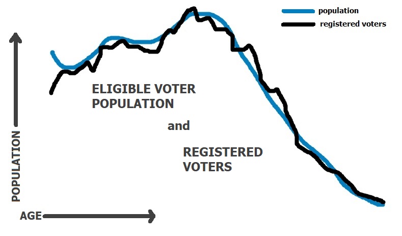
The graph line of the eligible voter population can be compared to a similar graph line of registered voters in that district. Historically, the ratio of registered voters to eligible voters has run at roughly 70%, perhaps plus or minus 10%, depending on the nature of the jurisdiction and the circumstances. Dr. Frank found that for 2020, the ratio was considerably higher.
The implications are that the voting jurisdiction has created a "credit line" of voters to utilize during election processing as needed. Remember, theft perpetrators came up with estimates of ballots that would be cast, and based on their estimates calculated how many additional ballots they could insert into an age slot without it being questioned.
Notice that sometimes the registered voters graph line pops above the population graph line. OOPS! Judicial Watch actually cited 353 counties in the US in which that was the case. The implication is that those county voter rolls REALLY need to be cleaned out.
As Dr. Frank would say,
"That ain't natural, buddy!"
Suppose the election was progressing to the point at which the voter credit line was completely exhausted. The perpetrators would have to resort to other ways of adding ballots into the election system to ensure their candidate won. Those strategies won't be discussed here. But do recall that in several states on election night, 2020, counting was halted.
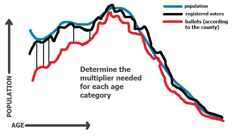
A correlation coefficient is a measure of how well two sets of data match. One set consists of predicted values and one set consists of actual values. A coefficient of 0 means the predicted values do not match the actual values at all (0%). A coefficient of 1 means the predicted values perfectly match the actual values (100%). For our purposes, the number of ballots cast are the actual values. ("Number of ballots" here means the number of ballots the county says were cast, not the "clean" number cast, devoid of any possible fraud.) Dr. Frank found a way to predict the number of ballots cast.
For each county he analyzed, Dr. Frank produced population (blue line) and registered voter (black line) graphs, which show an abnormally high correlation. That is the FIRST red flag. He then produced a third graph (red line), showing the number of ballots the county said were cast. The number of ballots cast will normally be a fraction of the number of registered voters. But the graph, which is smaller than the other two graphs, is the same shape as the graph of registered voters. That is the SECOND red flag. Are the ballots of voters from ages 18 to 100 going to be cast proportionally to match the corresponding age demographic on the registered voter graph?
"That ain't natural, buddy!"
If the graphs of registered voters and ballots cast resemble each other so closely, is it possible to find a multiplier that can be applied to the registered voters graph line to overlay it on to the ballots cast graph line? YES. In Absolute Interference, Dr. Frank used Hamilton County Ohio as an example with a multiplier of .86.
The result is not a perfect fit. To obtain a perfect fit, one would need a proportion multiplier for each age. You would need 83 of them for ages 18 through 100. The graphic below shows lines measuring the difference between registered voters and ballots cast in order to make the black and red graph lines fit together.
Those 83 proportion multipliers form what Dr. Frank calls a registration key for the state. The proportion multipliers were calculated for one major county. The same multipliers were then used for every other county in the state. This happened throughout the country.
These 83 proportion multipliers can then be used by computers to dip into the voter "credit line" and find a voter record of the right age to take up the right age slot. The slot can be filled right up to the voter registration line (100% turnout for that age).
The registration key is a sixth order polynomial that is used to draw the graph line of predicted ballots cast. It can be derived in an Excel spreadsheet. Indeed, in the Cybersymposium Dr. Frank stated the 2020 election was stolen with an Excel spreadsheet.
The key for a given state is calculated from one county in that state. It is then applied to that state's remaining counties. It can be used to predict the ballots cast for each county with an extremely high rate of accuracy (a correlation coefficient close to 1). So without actually looking at the ballots cast of the remaining counties in the state, Dr. Frank can predict the ballots cast with almost perfect accuracy.
Such a tactic can only be executed by computing machines not by a few humans. Not only that, but the execution of a strategy in which a calculation from one county seeds the calculations for the remaining counties in that state implies coordination at the state level.
Dr. Frank has analyzed all 50 states and published his work on Rumble. Pay attention to the fourth graph line, in pale purple. The fourth line is the predicted ballots cast as calculated by the registration key. Since it so closely fits the red line of ballots cast, it can be difficult to see in the Rumble video. Also on the Rumble chart of each county is an R value. That is the correlation coefficient (how well the pale purple line and the red line match each other).
In Utah, Salt Lake County was used to form the registration key. Therefore, for Salt Lake County you will see the correlation coefficient = 1. We would expect the coefficients for the remaining counties to be slightly less than 1 due to slightly different demographics.
At a voting machine Logic & Accuracy (L&A) demo in Salt Lake County in October of 2021, the Salt Lake County clerk explained the high 2020 voter turnout rate for the county of 90% was due to Trump and COVID.
Dr Frank's Utah Data on Rumble
Major takeaways
Inflated voter rolls are the means by which this theft strategy is executed.
Dr. Frank's Telegram Channel
Follow the Data with Dr. Frank
From /t.me/FollowTheData/1705...
"Lack of Good Information"
The situation I encountered in Kentucky is illustrative. The legislators there were under the impression that their voter rolls were being cleaned up.
Ha! They have some of the dirtiest rolls in the country.
One of the legislators asked, "But it's the same in all the other states, right?"
I had to break the bad news to him. Nope. Kentucky is one of the worst.
Please don't think I'm picking on Kentucky. At least they show up for the meetings.
If you try to hold meetings like this in Utah, the Republican party there will try to destroy your carreer.
I don't even need to show these guys any calculations. I just show them their own data and their jaws fall open.